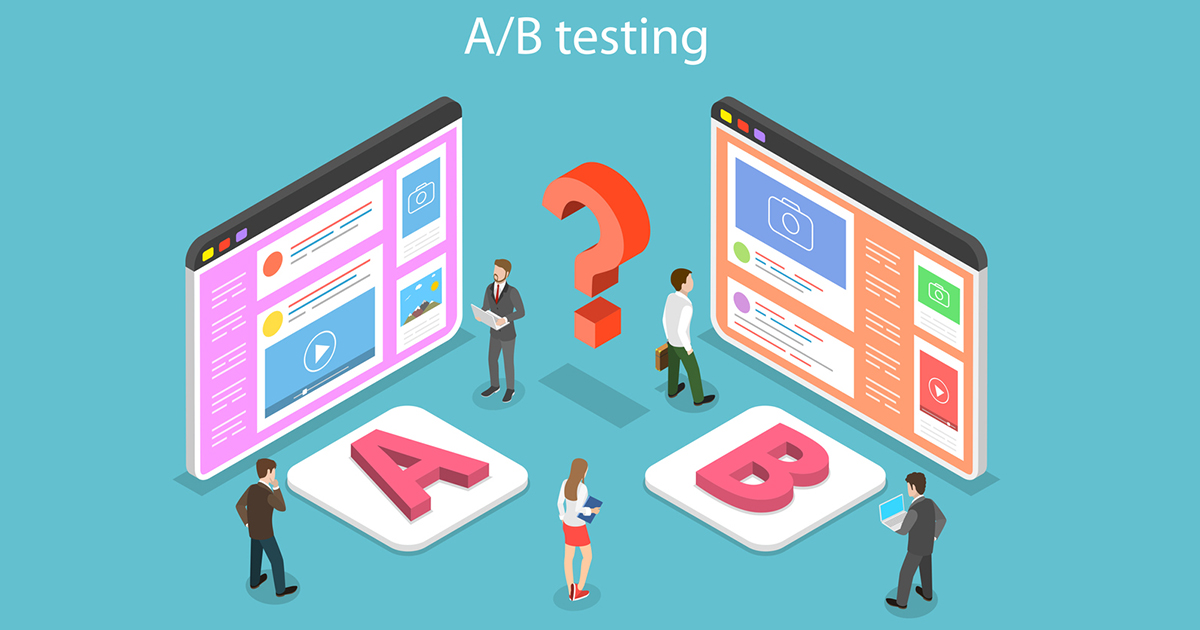
In recent years, competition on the Internet has grown and businesses are looking for something to give them a competitive edge. Online marketing methods like SEO and PPC are a good way of improving a company’s ability to compete, but increased traffic alone does not make for a successful business. When it comes to a website, it all comes down to the number of conversions and revenue generated – this is where a/b testing can help.
First, What is an A/B Test?
A/B testing is a method where an alternate version of an element within a website can be displayed to a group of users in order to track its effect on conversion rates.
For A/B testing to be worthwhile, there are two basics a site must have:
1. A Conversion Point
The way A/B testing works is that for each conversion a site receives, a check will be performed to see which version of the tested component was visible to the user. Common conversions easily tracked are a sale through an ecommerce website or the submission of a form.
2. Traffic
A/B testing is about the numbers, so to be accurate A/B testing needs to gather a respectable amount of results. Although a result can be gained with low levels of traffic the data needs to be gathered for a longer period of time.
What to Test?
With A/B testing you have the ability to test just about everything. It may be that you change the color of a button or the headline of a page. However, it is not just what to change but how to change it.
For an example, would your users respond better to a more powerful nature by changing the buy button to read ‘Buy Now’ or would they prefer something a little less committal like ‘Add to Cart’?
How about the color? A buy button should stand out, but would blue be a better color than green or red?
What about the position? Would your buy button be better to the left or to the right? Should it be placed next to the price or quantity input?
Maybe it’s the size of your buy button. Would increasing the size lead to more conversions? Or maybe your button is too big and you should make it a bit smaller
Could a border improve conversion? How about a shopping cart icon – maybe enabling users to quickly identify what the purpose of the button is.
It is possible your buy button is simply overcrowded. Maybe a minimal design would be more appreciated.
So these are just a few of the changes that could be found on a single element, but can apply to almost every area of a website.
The benefit of A/B testing is clear, given the right conditions it will provide data to allow you to make a decision as to whether or not an altered element converts better than the baseline.
To get a good understanding of what it is you should be testing it’s best to have a good amount of data to help inform your decisions. Analytics of user activity is invaluable in helping to indicate the actions of users allowing you to better target pages of concern where the biggest increases may be found.
Contact our marketing department for more information on the benefits and process of A/B Testing.


