First impressions are everything, especially when you market your industrial business online. Even in industrial and manufacturing businesses where sales are based on relationships and trust, a great website is crucial. Your website will act as a guide for customers, a source of consistent inbound leads, and a powerful sales tool. By designing a great website, you can ensure that you’re putting your best foot forward for customers and potential employees.
As 2023 shifts into high gear, we’re expecting to see several trends in great industrial web design. Among them are a focus on responsive mobile design, minimalistic formats, user-centered design, and interactivity. When combined, the best industrial website designs of 2023 will offer an exciting and immersive experience to users.
In this blog, we’ll share seven of the best industrial website design examples of 2023. Read on to learn what makes these businesses stand out from the competition.
Amacoil’s Accessible Website Copy
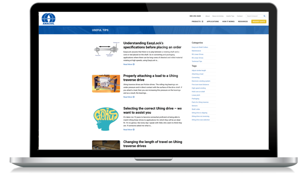
Amacoil is an industrial B2B sales company and distributor of Linear Motion Mechanical Solutions. Amacoil distributes linear motion mechanical solutions to manufacturers in a range of industries including automotive, medical, packaging, and industrial automation. Their products (rolling ring drives and assemblies) are used in machinery that needs backlash-free linear motion components.
The Amacoil website earns a spot on the best industrial website design examples because of its accessible, easy-to-understand copy. For those that don’t have experience in Amacoil’s niche, it can be hard to understand the technical aspects of the business. But Amacoil has clearly dedicated time to making their complex and technical business more approachable. Visitors to their site can leave with a new understanding and appreciation for their vital manufacturing products.
To further their dedication to the accessibility of its content, Amacoil has created a page titled “Useful Tips.” This section of the website provides valuable insights to clients looking into using such technologies within their own organizations’ environments. “Useful Tips” functions as a quick guide that ensures clients can get what they came looking for without leaving confused or frustrated.
Navigating with Firerock
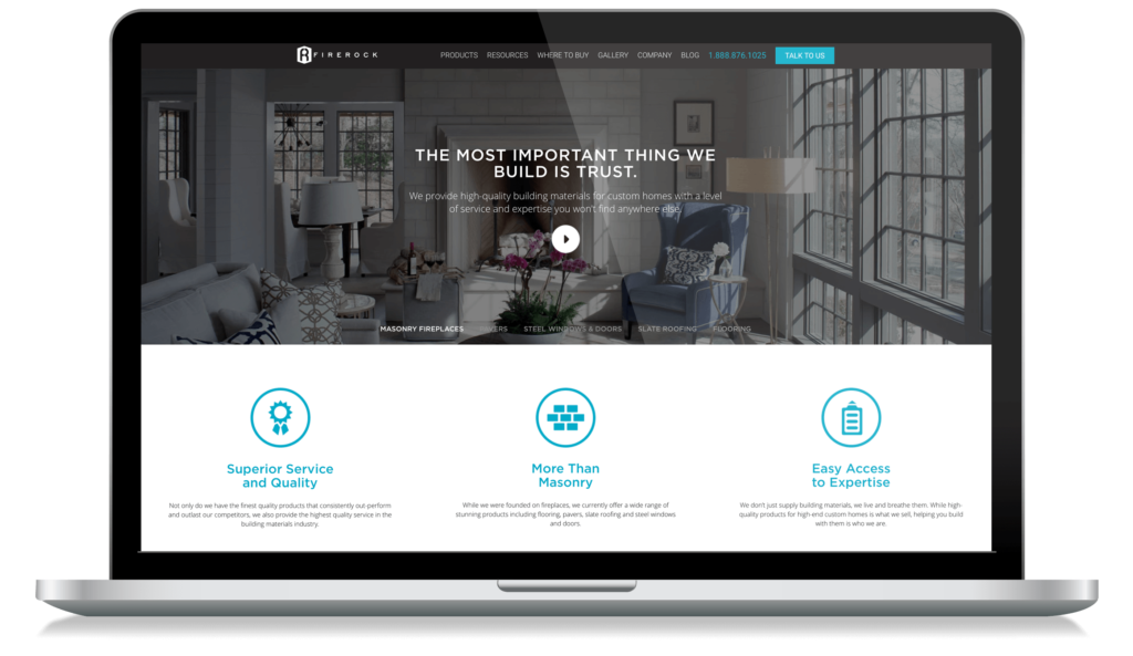
Firerock is a manufacturer of building materials for residential construction. Their manufacturing capabilities include masonry, pavers, slate roofing, wooden floors, and steel doors & windows. They are the only industrial company on this list that is both B2B and B2C in nature, blending the best of both worlds in its exceptional navigation.
The site combines a clean design with an intuitive user experience to ensure users can easily find what they need. There’s no clutter on the page or in the navigation that could overwhelm or frustrate visitors – mirroring their design style. In addition to its excellent menu navigation, Firerock has created a user-friendly product catalog. Users can use filters (e.g., “Slate Roofing”) to quickly browse their product options. Additional filters include price and material.
Brandywine Photonics & Immersive Web Design
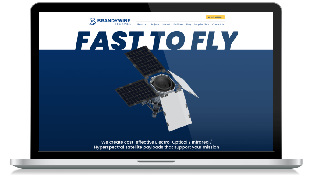
Brandywine Photonics is a developer and manufacturer of low-cost infrared satellite payloads for weather, climate, defense, commercial remote sensing, and scientific applications. They provide Earth Intelligence across the spectrum from UV to VIS and Far Infrared.
Interactivity takes the center stage on the homepage with interactive images that move in response to your curser’s positioning. The Brandywine Photonics website is an immersive experience as users explore more. By using images and conversational website copy, the company shows users the implications of its work in Earth Intelligence in a down-to-earth manner. All these elements combined create an immersive experience that showcases the impact their work has on our lives every day!
B&G Manufacturing Group – An Excellent Example of Responsive Web Design
B&G Manufacturing Group is a fastener and precision parts supplier based in the United States. They manufacture products for industries ranging from aerospace to automotive, medical, and more.
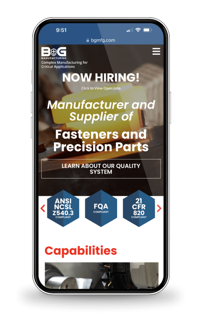
From the perspective of a B2B industrial marketing agency, the B&G website stands as an example of responsive web design. On a desktop or laptop computer, users will see bold and dynamic layouts that use space in a highly creative format. Many of these formats are simply impossible to display on mobile. So, for mobile devices, B&G Manufacturing has planned a second, unique layout. Both layouts are equally effective at conveying information about their company and the services offered.
In terms of imagery, B&G Manufacturing uses action shots throughout the site to evoke a sense of excitement in users. These images also allow users an opportunity to get to know B&G better through visual methods, rather than having them read several paragraphs (which would be challenging if readers were using their phones).
Sharretts Plating & Effective Calls to Action
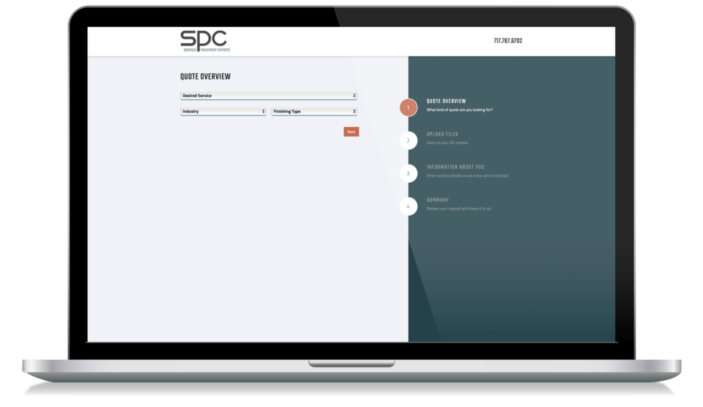
Sharretts Plating offers industrial plating for auto, electronics, hardware, and solar. They offer a vast array of metal plating services like gold, silver, and nickel. But they aren’t just known for their expansive manufacturing capabilities, they’re known for their website’s innovative strategy.
The Sharretts Plating website strikes a balance between content marketing and good design; however, its most exceptional element is its prevalent contact forms and conversational calls to action (CTAs). On this site, CTAs and contact forms can be found around every corner. This makes it easy for visitors to reach out with questions or inquiries about their products or services.
BRD Noise and Vibration Control, Inc. & Emotional Web Design
BRD Noise and Vibration Control, Inc. is the designer and manufacturer of Hushcore HVAC noise and vibration control solutions. As a B2B Manufacturer of acoustic solutions, they are driven to meet and exceed the needs of customers by providing quality products, exceptional service, and innovation.
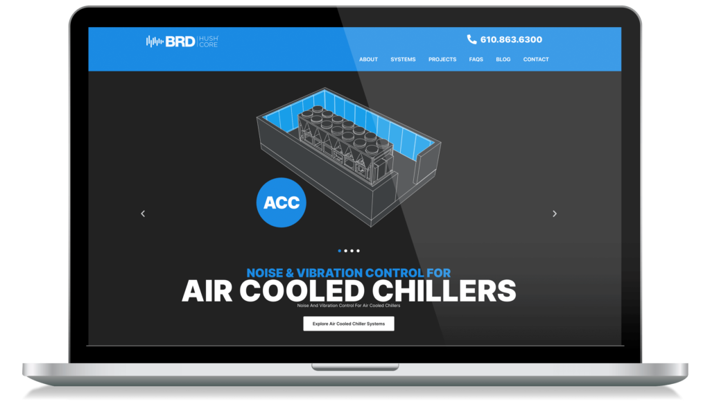
Product applications include items like air coolers, rooftop units, water-cooled chillers, air terminal units (ATUs), etc. These are items that are around us all the time, but we don’t notice unless they’re disruptive. To mimic the calming effect of their products, BRD uses emotional web design to inspire tranquility and trust. To evoke these emotions, BRD uses the color blue (which symbolizes calm and integrity) throughout their website.
KMM Group LTD. & Minimalist Design
The KMM Group LTD is a manufacturer of medical devices, racing, defense aerospace, and more. The company tagline is simple but moving: “If you can imagine it, we can make it.”
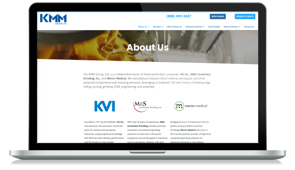
The KMM Group is a fusion of three different organizations that all have unique histories and values–but when combined under one roof (or rather URL), they form an unstoppable force in industrial design. This means there’s a lot to cover on the website–which means any visitor needs to be able to quickly get the information they need without being distracted by anything else. The homepage does exactly this by delivering content with minimalistic design elements while still making sure visitors know exactly who they’re dealing with before signing up for their newsletter subscription list or visiting their factories’ locations around the world!
Build the Best Industrial Website
From user-centered design to clear and consistent messaging, a great website requires great creativity. If you are looking to build one of the best industrial websites this year, you’ll need to include the features these websites embody.
There are many ways to design a great industrial website, but with the help of a B2B industrial marketing agency. By following these examples, your business could easily become of the best industrial website design examples.

