In everyday conversation, there’s a major focus on being rational, impartial, and practical in our decision-making. We read endless articles and watch countless hours of video content to learn and build informed opinions. But when it comes to purchasing, we aren’t as logical as we like to think.
In fact, a study conducted by a Harvard professor in 2018 states that 95% of buying decisions are subconscious. As a business leader, you need to understand why emotion matters in web design to make sure your website elicits the right emotional response.
What is Emotional Web Design
Emotional web design is the art of making your online offerings feel as real, authentic, and useful as your services are in real life. In other words, emotional design makes users connect with your business and act on that connection.
The key here is that emotions are contagious; we catch them from one another like viruses at a cocktail party. When someone gets excited about an idea then everyone else around them becomes excited too. The same goes for sadness or boredom, which can be worse than anger in business. If you want to get people excited about what your company does, then you need them to feel something positive.
How to Design a Website with Emotional Impact
As a CEO or marketing decision maker at your company, you can create craft a website that elicits a positive emotional reaction in prospects. To do so, it’s important to understand how users interact with websites. If you’re not sure where to start with emotional web design, start with the basics. Think about the colors your website uses, the images users see, and the tone of voice they hear as they read your content.
Consider Color

Color is a powerful tool for evoking emotion. Colors can be used to make your website look professional, stand out from the competition, and communicate your brand’s personality.
When choosing colors for your design, it is important to consider how they affect people emotionally because this will influence their perception of the overall site design. Do you want to inspire trust? Follow the advice of IQnection’s Graphic Designer, Amy Lewis, and choose blue. “…Blues evoke trust and calmness, that is why so many medical and financial institutions use the blue family in their branding. Taste and tone are essential in these industries because of the high level of trust that is needed.” For food and beverage manufacturers looking to influence a user’s appetite, Amy recommends livelier colors. “Orange and red can actually cause hunger, that’s why so many fast-food chains use orange in their branding.”
Finally, our resident color-theory and design expert, Amy, urges you to remember that the meaning of color is cultural. “Using the proper color is also important because one culture might see a color such as white as pure and innocent while another culture thinks white represents death and funerals.” So, ensure you are making the right impression by ensuring your audience derives the intended meaning from your website’s color scheme.
Use Effective Imagery
The cliché is true, a picture really is worth a thousand words. So, using the right images on your website is crucial. When selecting images for your website, choose high-quality images that reflect your clients’ wants and needs. You should also include original images of your team, products, and services to show them that there are real people on the other side of the screen. We can all agree that no one would trust an investment firm with a website featuring low-quality images of monster trucks.
Using images that are well-composed, original, and reflective of your clients will influence their user behavior. When they can see themselves on your website, they’ll feel an undeniable connection.
Speak in Your Brand Voice
When you write web copy, it’s important to speak in your brand voice. A brand voice is how a company or organization sounds and feels when they communicate with customers. This can be anything from an informal tone, like Slack’s “We’re here for you,” or a more formal tone like MoneySuperMarket’s “Get started today.”
When it comes down to it, good website copy tells a story that connects with visitors on an emotional level. And if there’s one thing humans are good at (besides eating carbs), it’s telling stories! Leverage yours throughout your copy to make a personal, human connection with users.
Examples of Websites with a Strong Emotional Impact
There are many good websites out there, but a great website makes you feel something. Read on to see some of IQnections favorite websites that prove why emotion matters in web design.
There are many good websites out there, but a great website makes you feel something. Read on to see some of IQnections favorite websites that prove why emotion matters in web design.
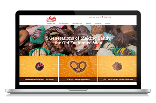
Stutz Candy
Stutz Candy is a candy manufacturer and seller based in Pennsylvania that offers nation-wide service. They’re an excellent example of how color and image selection play into emotional web design. One every page, users are met with red colors to inspire hunger, and brown to remind the user of chocolate. These colors are further complimented by high-quality images of happy families enjoying delicious, sweet treats. Who can’t relate to that?

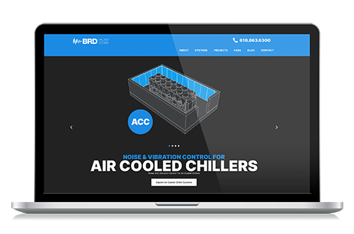
Hushcore
BRD, the creators of the Hushcore® noise and vibration control system, uses emotional design to its fullest. The companies’ Hushcore system is the reason why your rooftop air handling units remain quiet, they allow you to enjoy a calm space. By using blue in their brand colors and throughout their website, they inspire serenity in any user on their website.

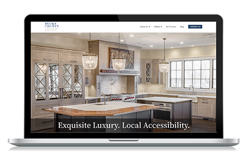
Bucks County Cabinetry & Design
This high-end cabinetry designer and supplier uses images to bring out the users creative side, while inviting them to explore their services further. By utilizing original images of their exquisite cabinetry designs at the top of their home page, they inspire users to take a hard look at their own living spaces and reach out for explore their renovation options.

How to Evoke Emotion on Your Website
At the end of the day, great web design and web development is all about empathy. When you’re building a website, you need to consider the subconscious, emotional reactions you want your users to experience. Then, you need to create the perfect environment to influence their emotions and ultimately, their buying behavior.
Emotion matters in plays a huge part in how we experience the world and how we interact with it. Web design is no exception. You can anticipate and influence the emotions of users to connect with your audience, build trust, and make more sales. For more Emotion is important because it can help you connect with your audience, build trust and make sales. For more information on how you can influence user behavior with emotional design, visit our web design page.


