Good websites are often created with a specific purpose in mind. Think about it: a restaurant’s website needs to show off its best dishes, while a dentist’s website should feature before-and-after photos of patients’ smiles. A great website, on the other hand, is one that stands out from all the rest. It’s memorable, professional, and engaging — qualities that make people want to do business with you rather than your competitors!
The 5 Characteristics of a Good Website
A good website is one that’s user-friendly and caters to the needs of its audience. A great website goes beyond this, providing an experience that leaves visitors feeling satisfied and ready to act. To achieve this level of success, you need to think about your site as a whole–from the design down to the content and call-to-action buttons.
At the end of the day, a good website is centered around user experience. But how do you know if your industrial B2B website is serving the needs of your clients? There are five characteristics that make an industrial website successful. Read on to learn more about them.
User-friendly Navigation
The navigation of your website is the backbone of its usability. It should be easy to find and use, or else users will leave your site for one that is more user-friendly. Consider how you want people to interact with your site before choosing an appropriate navigation design.
The best way to ensure users can get what they need quickly is by optimizing their experience with clear labels, intuitive design, and useful links within each page’s content (e.g., “Contact” link).
Mobile Responsiveness

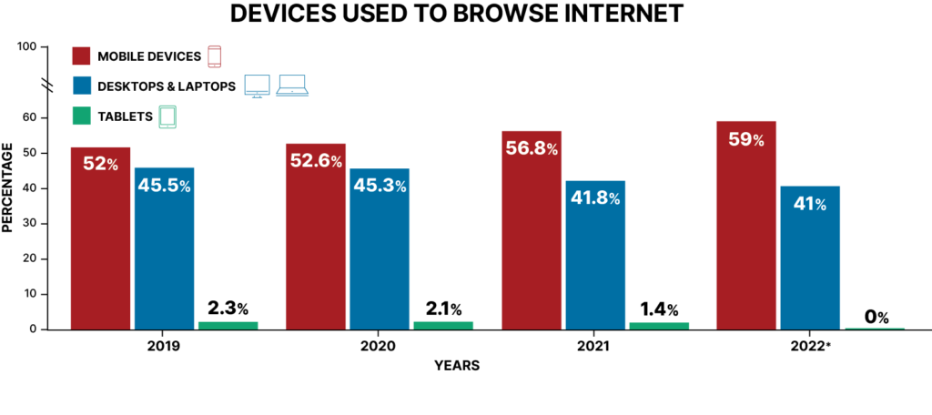
Source: Statista
It is no secret that people are spending more time on their phones than ever before. In fact, the average user checks their device 96 times per day! Every time you visit a website on your phone, you must ask yourself: “Is this site easy to use?” If not, chances are good that you will not be visiting it again anytime soon.
That is why it’s so important for websites in today’s digital age to be mobile responsive–that is, designed so they work equally well whether accessed from a desktop computer or from a handheld device such as a smartphone or tablet. When people visit your site via their phones instead of their computers (or vice versa), they want an experience like what they get when using their PC–and that means no zooming in and out just because of poor layout choices made by designers who were designing for one screen size only.
Clear and Concise Content
As we mentioned, people are busy and have shorter attention spans. So, props to you if you’ve made it this far.
Typically, users don’t have time to read long blocks of text or slog through a bunch of paragraphs. You need to make sure your content is clear and concise so that users can easily understand you in just a few seconds.
Here are some tips for keeping your copy short:
- Use short sentences and paragraphs–sentences should be no longer than 20 words, while paragraphs shouldn’t exceed three sentences long.
- Use bullet points and numbered lists wherever possible (you’ll notice that we’re doing that, right now.)
- Choose an easy-to-read font like Calibri or Arial.
Following these tips for effective copywriting on your website, and focusing on brand storytelling, helps you earn trust without overselling yourself. It’s the foundation of designing an effective website.
Fast Loading Speed
If your site takes too long to load, you’re going to miss out on countless opportunities.
The average user will leave if they can’t access your site quickly, decreasing the number of leads you could be getting. Slow pages also have a negative impact on your industrial website marketing analytics. When people leave your website because it is slow loading, your website’s “bounce rate” increases. The higher the bounce rate, the less successful the site. This can lead to reprioritization in search results and fewer leads for you!
Visually Appealing Design
When comparing two companies who sell similar products or services, visual appeal is a critical part of the decision. It’s the first thing visitors will notice, and it can make or break your brand. So, when you’re designing a new manufacturing website, don’t forget about the basic human necessities.
A visually appealing design is one that is pleasing to the eye. It uses elements like color, contrast and proportion to create harmony within the page layout while also complementing all other aspects of your website (like content). A bonus feature that will set you above your competition is accessibility features.
What Defines a Great Website?
Good websites have five characteristics that define award winning design:
- Consistent branding and visual identity
- Engaging user experiences (UX)
- Relevant, valuable, and new content
- Advanced technical features
Investing your time, energy, and efforts into creating a great web development is an investment in your business’s future. It makes your manufacturing company’s brand more memorable and can become a consistent source of high-quality leads.
The Difference Between Good and Great Industrial B2B websites

Great industrial B2B websites are ones that have a purpose. They tell you what their business is, what they do and why they’re different. It’s not just about showing off your company logo or a flashy video – it’s about giving people an idea of what makes you different to other companies in your industry. Great websites give users reasons why they should choose to work with YOU over someone else.
Great industrial B2B websites also have great content on them – whether it be text or images – so that when visitors land on the site they can easily find what they want without having too much information thrown at them all at once (which leads me nicely onto my next point!).
Ways to Increase Conversions on Your Industrial B2B Website
Great manufacturing web design leads to consistent, high-quality in-bound leads for your business. As you’re working to design a website that achieves this goal, you need to consider how you will optimize the site for conversions. Consider our seven tips for increasing conversions on your manufacturing B2B website:
- Optimize User Experience – User behavior on your website doesn’t have to be a mystery. You can use user tracking tools like HotJar to see what content your users are most interested in and design your site around concrete data.
- Use Social Proof – Word-of-mouth marketing will always be the most powerful tool to grow your business. While you can’t control what your customers say, you can feature positive reviews and testimonials on your website to earn trust.
- Utilize Personalization – To personalize a website, you need to get creative when writing your content. Use the data you must tailor your landing pages to your users’ specific needs.
- Offer a Customizable Experience – You’re manufacturing B2B website is not a social networking platform, so you don’t want to allow users to create custom feeds of information. Instead, offer premium, downloadable content offers. This allows your users the opportunity to craft their own experience on your website.
- A/B Testing – Trends in user behavior and website design change over time. To stay ahead of the curve, you should A/B test your website, piece by piece. This experimentation will allow you to see what content, images, and layouts work best for your users.
- Use Chat Bots – Think of a chat bot as your website’s automated assistant. Chat bots allow users to explore products, get support, and send you their contact information through natural conversation.
- Optimize Your Contact Forms – We understand that you want to gather as much information on your prospects as possible before you make that first connection. But in the world of web design, long contact forms don’t get submissions. Keep your forms short and easy to use. Keep your forms to four or less fields to get more leads.
Build a Great Website, not a Good Website
In the end, it comes down to one thing: good websites are not great. Great websites, on the other hand, have a purpose and can help your business succeed. They’re built with SEO (Search Engine Optimization) in mind and prioritize value to users. This can be difficult to achieve on your own, so don’t start the web design journey without a guide. Visit our web design page to learn how we can help you design, launch, and manage a great website.


