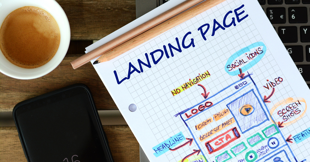
Let’s hear it for landing pages, the unsung heroes of successful inbound marketing strategies.
Videos and blog posts might be the marquee players, but a good landing page is the backbone of your marketing efforts. Note that we said a good landing page. That’s because creating one that turns visitors into leads is as much an art as it is a science.

Here are a few tips to follow to help you win landing page conversions.
1. Start With A Solid Headline
Anyone who has ever worked on a newspaper copydesk will tell you the value of a great headline. It’s no different in marketing. A good headline is informative. A great one goes beyond answering “What?” to telling your visitors “How.”
2. Keep Them Focused On The Page
Your landing page design should make it clear what you want visitors to do: fill out a form, download an e-book, etc. But it shouldn’t tempt them to click away from the landing page. Remove any other clickable links, or at least try not to emphasize them.
Your landing page should also try to cut down on visual disruptions. Having a mix of colors, font styles and font sizes can be distracting.
3. Speak To Visitors With A Variety Of Needs
We talk a lot on this blog about the buyer’s journey, and how different visitors to your site have different needs. Your landing page should take those differences into account. For example, testimonials or case studies can speak to visitors in the consideration stage of the journey, while a “Request a Free Trial” button is for visitors who are about to become customers.
4. Make It Easy To Scan
Here are five words to keep in mind when creating web content: People don’t read, they scan.
Memorize it, write it on a post-it note on your monitor, tattoo it on your hand like the guy in Memento. It’s a cardinal rule of writing content for the web. Visitors to your site will read less than 30 percent of what you’ve written. Make sure you get your point across quickly, and use easily digestible chunks of text and bulleted lists.
5. Create A Clear Call To Action
Your call to action should be a beacon on your page, spelling out precisely what happens if visitors click your link or fill out your form. Make it easy to locate on the page, and let readers know that it has value. Don’t just say “Download Now,” tell them “Download Your Free White Paper.”
Your landing page design should include an offer that is compelling and clear. Don’t flood the page with multiple offers. This will only confuse your visitors.
6. Say “Thank you”
Your visitor has converted, and that means your job is done, right? Not quite. You still need to keep them on your site. One way to do that is with a “Thank You” page that holds their interest, with links to related, more detailed content, or content such as case studies or video. It shows your new customers that you value their interest in what you do.
If you need help creating landing pages – or help fashioning a marketing strategy that leads potential customers to those pages, contact IQnection.
We’ve spent more than 16 years working with businesses like yours to create digital marketing content that attracts, converts and delights your ideal customers. Let us help you with landing page design that’s the hero of your website.
{{cta(’67fa9060-2578-486e-8c20-f3047046f131′)}}


